May 2009
Biased Image Reduction
introduction of the problem
Searchme (www.searchme.com) with
a corpus of billions of indexed web pages contains one of the worlds
largest collections of thumbnail images. These images have been
rendered from the world wide web, in order that they may be presented
in a visual interface as search engine results without the delay at the
search engine query time.
The final presentation size being a percentage of the client window
varies with browser, operating system, computer or even mobile
device. In order to maintain fidelity the pre-rendered images are
generally oversampled or sampled at a higher resolution than we would
generally anticipate displaying. While it is generally possible
to quickly reduce the size of the image and maintain fidelity, web
pages largely being text (or fine light glyphs) on monochromatic and
contrasting background scale down relatively poorly. The
sub-graphics and other features such as gray scales, tone delimited
zones etc. scale much better than the text, but the text which is of
primary importance and the reason the page is ranked high as a search
result fares less well. You many note that while graphical layout
and images are valuable for context, the text itself largely what
answers the user intent of the search query or directs the user to
further discriminate one page versus another. It is important
that it be as legible as possible.
While maximizing the size available to display thumbnails in a graphics
based search engine is important, the necessity of displaying a
reduced sized image remains. Each thumbnail represents the
information that was intended to be full
screen content in its original context but in displaying the
multiplicity of results one would need to display at least a small part
of a small number of pages to aid in review and navigation of results.
analysis
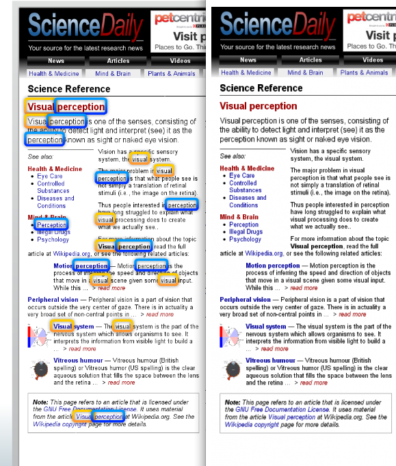
The following image (figure 1,left ) was captured as a Searchme, search
engine result for the query visual
perception as displayed for a standard sized laptop
screen. Note the fragility of several of the words. It
looks as though the printer ran dry on ink as it printed the text on
this page. What has really happened is that he algorithm has
preserved the dominance of the background color as it removes image
content. The algorithm was blind to the relatively sparse content
(or the pixels in the typography) in contrast to the dominating
background. The background wins or dominates the results washing
out what should be strong lines or letter features.
solution
A relatively simple and cheep method for enhancing the image therefore
is to determine the background color and then weigh (or bias) all other
colors disproportionately stronger. Fortunately the bounding text
rectangles are stored along side of the image as part of the rendering
process. With these rectangles the possibility of determining the
background color underneath the words. Simply circumscribing the
text word and finding a monochromatic base was all I needed to
determine the background color, thus this algorithm proved successful
on back letters on white, as well as white letters on black, or any off
color letters on top of any monochromatic background.
Figure 1, right is result of the the biased scaling. After a bit
of experimentation a bias weight of just under three seemed generally
yields the best results. This makes intuitive sense as there are
approximately 3 pixels of white for each pixel of black on a standard
font and you must preserve a good amount of background in order to
prevent your letters from annealing together.
figure 1. Thumbnail of page with text and small graphics
resized using (on the left) the current production resize from the same
source (on the right) with biased image reduction algorithm.
modest refinement
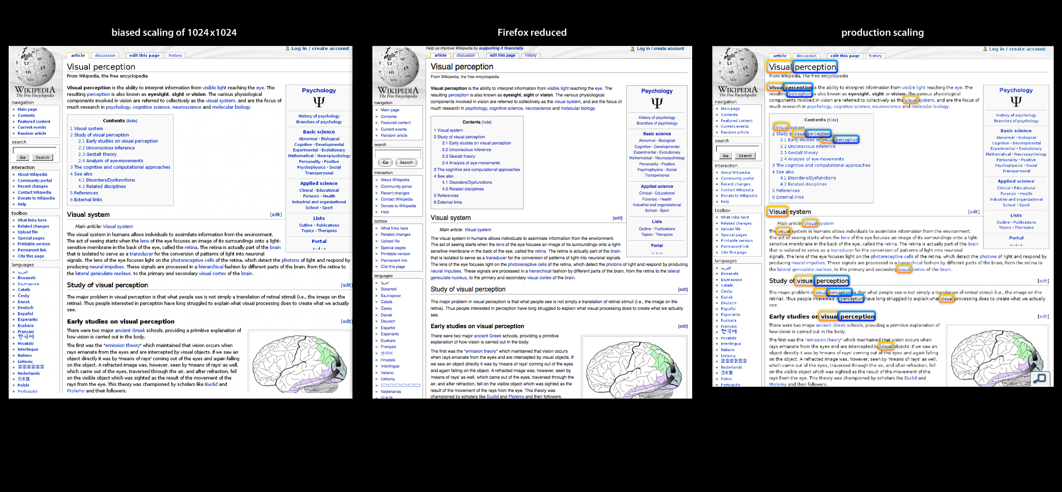
Note that the text on figure1, right seems just a little blurry as an
attribute of the averaging. These half tone pixels are actually
very important to the legibility as they are effectively sub-splitting
pixels to display both portion of foreground and a portion of
background. The following three section image (figure 2,
left) has applied the same bias scaling above, but I have followed with
a modest sharpening transformation (3x3 matrix
{{-1,-1,-1},{-1,32,-1},{-1,-1,-1}}, 24, 0}) to good effect.
figure 2, A composite of three
images of the same web page. The center image is a approximate rendering of the base
thumbnail using Firefox and the Zoom
In functionality on the original web page. This
functionality is the gold standard
for text legibility as it redraws (with anti-aliasing) the spline based
font at a smaller font size. Clearly coming closest to the
legibility of the center image is the left side which shows the results
of biased scaling followed up with a modest sharpening filter.
The right side shows the current production scaling.
references